


The behind the scenes of how we designed our new logo.
The Story
My cofounder and I worked in the same product team at Intercom.
Our teams spent hundreds of thousands of dollars on analytics tools. Yet we rarely used them. That’s when we left our jobs and decided to start June.
Analytics tools are complex, cold and intimidating. From the get go we wanted June to be simple, warm and approachable. The name June came from the first month of summer 🌸
We made our initial logo in one week. It was designed by Juliette Lagache when she was an intern at eFounders.

It was a playful mix of cubes. Similar to those babies play with. It illustrated what our product was: a simple product analytics for startups.
We wanted our product to be like the wooden square blocks kids use. Blocks are great because they’re simple and fixed in shape, but give enough freedom to stimulate your creativity. In the same way when we offer users our opinionated reports we don’t want it to be a highly controlled experience. We want to provide a simple playground that enables you to ask great questions.
Why a new logo
The first reason is inspirational. June has grown a lot since we started. It is not anymore just the simple product analytics for startups. It has evolved into a fully fledged product analytics for B2B SaaS. That helps them activate and retain accounts as they scale.
The second reason is technical. Over the past 2 years we learned that a great logo actually needs to follow some rules. In particular 3 rules:
- A logo should be immediately recognizable
- A logo should be readable
- A logo should fit well on any marketing materials
We noticed many times that our logo didn’t respect these rules.
So a few weeks ago we decided to partner with an expert to revamp it!
After meeting a few designers we decided to partner with Jord. We love Jord’s craftsmanship. It matches our belief that bringing great things to the world requires sweat and passion.
His sensibility about what we’re building made it clear that he was the right person to upgrade our logo. Also Jord had worked on outstanding logo designs, and as our friends’ ones at Typefully, Detail and IconJar:

The Process
Brief
Every designer has different preferences on how a brief should be. But the goal is simple, get clarity on what the client wants.
After the brief the direction of the project should be clear. You don’t want to waste people’s time repeating themselves. The kind of discussions you should be happy to have though are about tastes.

Sketch
There are millions of versions of what June's new logo could have become. But only one would exist. How does this work? In one word: sketches!
We explored dozens of sketches. At this stage we went broad to get a sense of what felt good, and not.

We shortlisted 5 candidates and moved to digital concepts.
This high fidelity work helped us validate the look and feel of our logo once vectorized. As you can see, they feel different from just sketches.

If nothing is convincing you should go back to sketching.
In our case we had a crush on one version. We decided to push it further with styling.
Styling
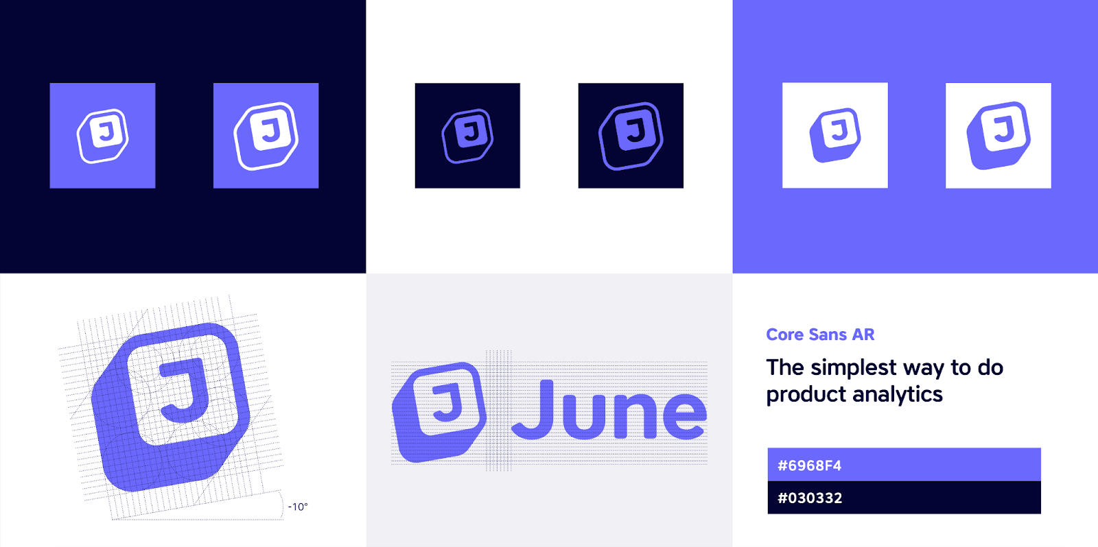
Styling is a way to assess if your logo will be able to shine. It tells you if it has a soul. In my opinion this is the moment of truth.
To assess that you want to play with colors and patterns:

Font proposal
The last step was from far the most painful one.
“What the hell is this logo? How am I supposed to read it?”
- Michael Seibel (Managing Director @ YC) seeing our logo 2 years ago
A key issue we had with our initial logo was poor readability.
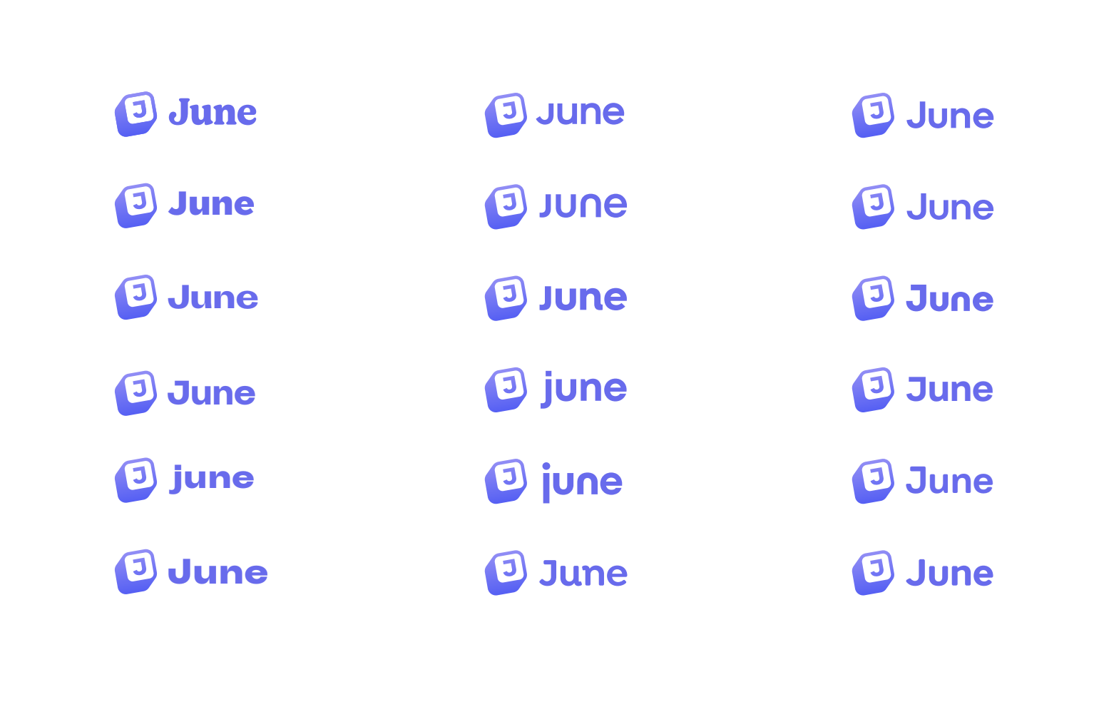
We decided the new one should have our name written next to an icon. We explored a wide variety of fonts, capitalizations, weight, and spacing. Probably hundreds. Then shortlisted them:
Final results
We picked our favourite and our new logo came to life:


It was exactly what we aimed for:
- It’s simple. Building a product is like an accordion. Sometimes you add features. Sometimes you trim your product. This logo is a trimmed version of the old one.
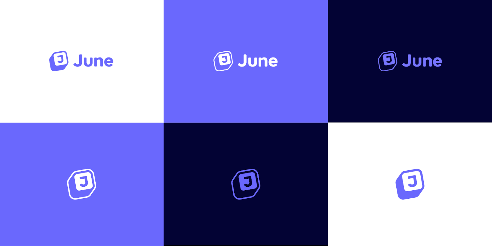
- It’s recognisable. Our new logo works black on white. Its shape is unique. You can differentiate it even in its most minimalist version.
- It illustrates what we do. A cube is a modular element. Assemble several and you can build anything. A product, or a set of analyzes. It illustrates perfectly the direction we’ve taken in the past two years. And where we’re going next.
- It’s professional. Over time we found our old logo a little childish. Given that our customers now are established companies we wanted something with a more professional look and feel.
The Result
Creating a logo requires following some rules. Like most things, we learned that after shipping the first version of our logo.
Building a great logo also requires some inspiration, and lots of talent.
Thanks to the team for thinking deeply about what we stand for, as a product, and as a company. And for their help creating a brief, or providing feedback along the way.
Thanks to Jord for bringing his talent. And for his thoughtful support throughout this collaboration.
This new logo illustrates what June has become: the next-generation analytics for B2B SaaS. To see what's coming next at June stay tuned!


