


SaaS businesses should understand how well their users engage with certain features and capabilities of their products.
Tracking feature usage can help you detect ones that aren’t being used much - helping you avoid feature creep.
But how can you keep track of the usage of all of your features at once? That’s where a feature audit can help.
What is a feature audit? Why is it important? How can you use it to improve feature adoption and reduce scope creep?
To conduct an effective feature audit, you can use a SaaS product analytics platform like June. Our feature audit template can get you up and running in no time!
Here's everything you need to know about feature audits for SaaS businesses and why you should conduct them.
What is a Feature Audit?
In order to find out what's working and what's not, SaaS products need to track the usage of their features. For this purpose, product analytics platforms track feature adoption and how frequently features are used.
A feature audit summarizes this information using a graph to give a general idea of how users engage with all features.
This graph plots two data points:
- X-Axis: What percentage of users are using this feature? This is known as popularity.
- Y-Axis: How often do customers use this feature? This is usually expressed by a percentage of users that engage with the feature daily, weekly or monthly, depending on your use case - i.e. the frequency.
Here’s an example of a typical feature audit:

How do you interpret a feature audit?
A feature audit categorizes features based on which quadrant they fall on a graph.
Here’s what each quadrant means:
Top Right Corner: Great!
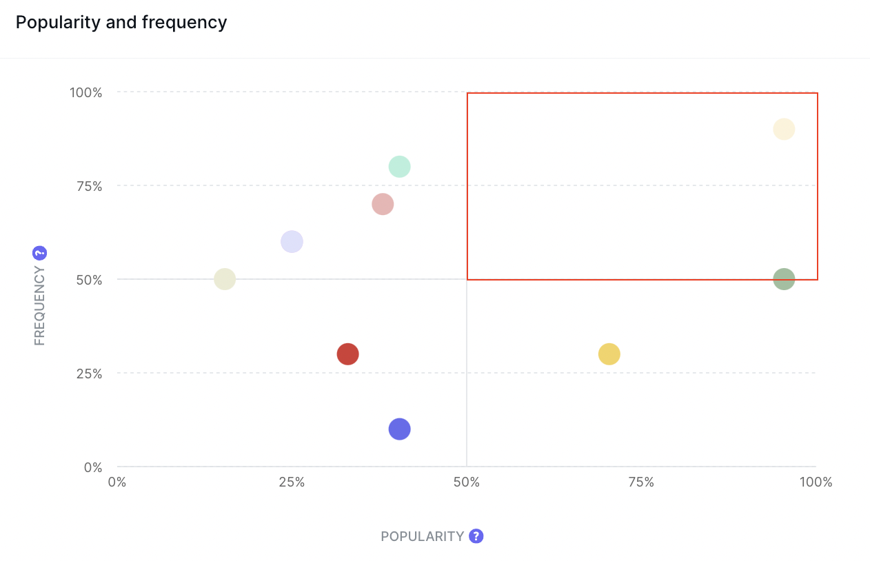
Let’s start off with the top-right-hand quadrant. Intuitively, if a feature is both popular and used frequently, that’s fantastic.
The majority of your customers use this feature very frequently and it's one of the core reasons why your users love the product. We’d call features that fall into this category “core features”.
The most popular features of your product should be the ones you market the most heavily. Why not create a feature landing page for it? Put this feature at the forefront of a demo!
These features should never be removed and you should be careful about dramatically overhauling these areas. But if you can make small quality of life improvements here, they can delight most of your users.
In our example feature audit, we can see that the beige feature has the highest usage here. In fact, this point represents an example product’s reports feature.
For an analytics platform like ours, report generating is a core feature - and so we’re not surprised this is so popular.
Top Left Corner: Low Popularity

If your feature falls into the top-left quadrant, it suffers from low popularity. This means your feature is frequently used by a minority of your users. The customers who use it, however, adore it.
There are two main reasons features fall into this category:
- Your feature is good, but not enough of your users know about it. Here, we have a discoverability issue.
- This feature offers a niche use case that only a subsection of your users finds relevant. Make sure ti understand who these users are. If those are paying customers or the ones that bring the most revenue then your go-to-market strategy is targeting the wrong audience.
If your feature is frequently used by a few users, chances are other users would also enjoy it. To solve this, you need to improve the discoverability of this feature. How?
Adding feature pages, beefing up your quick start guide and improving onboarding to highlight these features can push these features into the “Great!” category. You could also send out push notifications and emails letting users know about the feature.
It could also be that your feature isn’t easy enough to get to. Is it hidden in menus and drop-down lists that don’t make sense? Is it possible to make this feature more prominent on your dashboard?
But, remember, some features won’t be useful to everyone - and they could be niche. How do you know whether this is the case? If the same section of your userbase regularly uses this feature, this indicates it resonates with a certain type of customer.
With June, it’s easy to find who the most engaged users are. For B2B SaaS products, you can discover the top 30 individual feature users but also companies too!

If certain types of companies are using this feature, perhaps it's just a niche use case. There’s nothing wrong with a niche product - quite the opposite!
But, if you want to expand the reach of these features, consider adjusting this feature to be more relevant to other users. Communicating different use cases will help here too!
Bottom Right Corner: Low Frequency
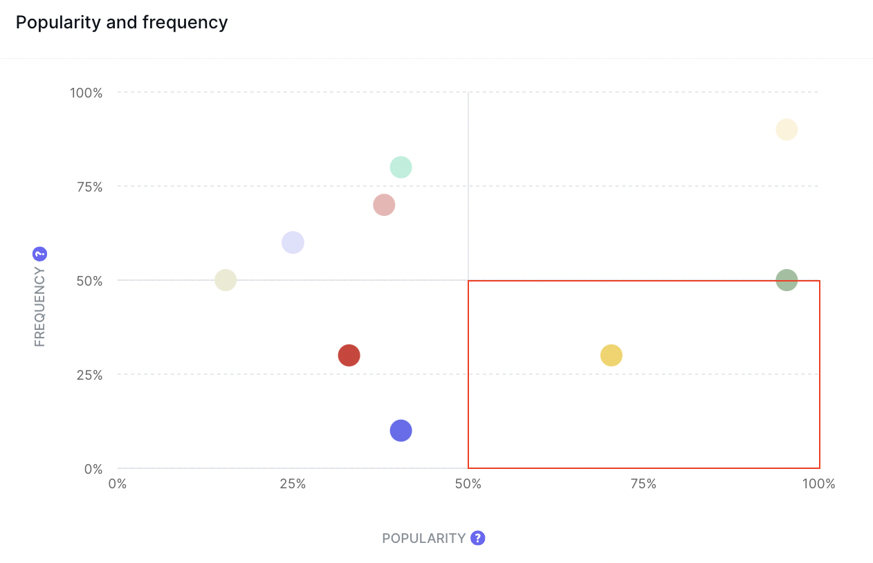
If features fall into this category, a lot of your customers are using this feature but not regularly enough.
If you think this feature should be a core feature, there are some barriers in the way stopping users from regularly interacting with the feature.
There are two primary reasons a feature could suffer from low frequency:
- The feature is not easy enough to use or integrated well enough into a user’s workflow. If this is the case, the high popularity shows that users want this feature to work for them. It's too much work to use this feature regularly right now.
- The feature naturally isn’t one that users will use very often. A classic example of this is an “import” or “migration” feature. Users only typically use this once. This is OK as these features aren’t intended to be frequent, core features.
If the former occurs, we need to work on how integrated the feature is in the workflow.
What changes can you make to make it easier for users to find the feature and use it regularly? Is your UI making it difficult for users to adopt this feature in their daily workflow? Could you add nudges like buttons and suggestions at places where users might benefit from this feature?
For example, users may be interested in using a customer support chatbot or wizard. But, if it’s buried in the settings or at the bottom of each page and interrupts what a user is doing, why would they use it regularly? A useful change here is to add a floating support bubble so that users can look for help without leaving the page they’re on.
Bottom Left Corner: Poor Features
This category is where you find features that aren’t worth keeping around. If a feature suffers from both low popularity and low frequency, you may wish to consider abandoning it.
What sort of reject criteria could you follow to decide whether to abandon features?
- How new is the feature? Some features may take some time to get off the ground and you shouldn’t be too quick to can what you’ve just launched. Conversely, if a feature has been around for a while and hasn’t gained any traction, it may be worth removing.
- How much effort and resources do you need to maintain it? If a feature doesn’t need much maintenance, you may not gain much from removing it. The few users that do use it might appreciate it sticking around.
- Is the feature too similar to another that is succeeding? Some features may be made redundant by other capabilities of your product. For example, a smart syncing feature may make an export tool redundant. Is there scope to combine features?
- Does the feature fit into the core vision of your product? Simply put, is it filler or do you consider it important enough to improve? Remember, your vision and strategy won’t always match up with what users want from your product. But, if you still consider it a core feature, you may wish to keep it around.
- Does a competitor achieve the same capabilities but better? A feature may struggle if a competing product achieves the desired results better and more quickly. You may wish to improve this feature to match what other SaaS firms are offering.
While quantitative metrics provide a great overview of your situation, real-world feedback helps you make better decisions. Why not conduct surveys or get in touch with power users to understand why they’re not using features?
Why is a Feature Audit important?
A feature audit is a way of visualizing feature adoption. But, why is it better than a simple bar chart of what percentage of users interact with all your features?
Well, because feature usage can change depending on various factors. If you simply canned every feature that wasn’t well used, you may be removing features that - given some adjustment and marketing - may succeed.
Feature audits offer two metrics to observe. If a feature isn’t used by many users, but those who do use it regularly, you may just need to improve discoverability. Conversely, if many are interested in using the feature, but don’t use it regularly, you should continue working on its accessibility.
Feature audits also identifiy which features aren’t working. Those features that consistently lie in the bottom-left quadrant aren’t providing value to customers. By prioritizing features outside of this danger zone, you can avoid feature creep and maximize your resource efficiency.
Finally, a feature audit can help you judge the overall effectiveness of your product.
If many features tend to stay in the bottom-left of the graph, there may be something wrong with your approach.
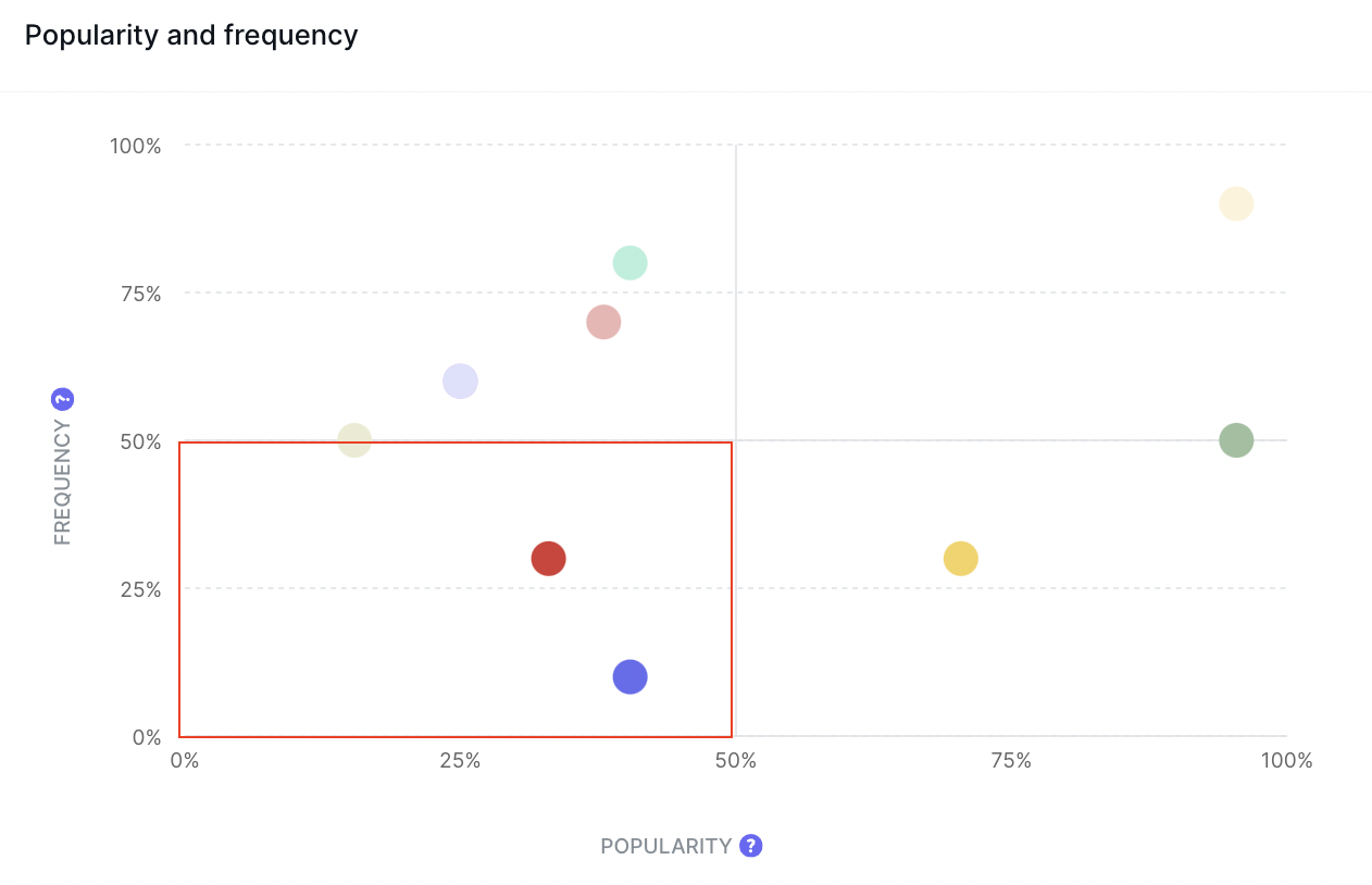
See this example here:

Five out of the six available features suffer from both low popularity and low frequency. The red point likely indicates a new feature and suggests its launch didn’t go as well as hoped.
But, what’s more concerning is the rest of these features. Not many users are actively using these product features - barring the blue one. This shows that the product suffers from severe feature creep. The product is bloated with features that users don’t find helpful.
If users don’t find your features useful, why would they stick around? This example product is at risk of serious churn. The company will need to rethink their strategy and refocus their efforts on the blue feature that is well received.
By focusing on features that users love, you build a leaner, more stable product. You’re not wasting resources on fighting losing battles. Your product teams can instead focus on improving the user experience and providing a more seamless user flow.
Conduct feature audits and observe other SaaS metrics with June
Product analytics helps you make better-informed decisions about your SaaS product. A feature audit is a brilliant tool for prioritizing features based on how well users engage with them.
June provides the perfect platform for conducting feature audits based on real-time data. Using our SaaS analytics tool, you can see how users interact with features over time and observe which features are most popular.
Check out our templates to see how June can instantly provide you with real-time insights into your product.
Our goal is to help SaaS companies build products that users love. A major aspect of this is focusing on features and events that resonate with your customers. That’s why we recommend tracking feature adoption, user engagement and retention.
Optimizing for these metrics helps build better customer experiences and will improve your profitability. What are you waiting for? Check out June today and unlock the power of data-driven insights for your SaaS product.


